
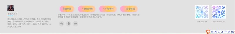
![图片[1]-子比主题—5个页脚四字导航采用 CSS 动画实现渐变色彩流动效果,内置配备点击跳转功能-老张资源网](https://zbzt.609265.xyz/wp-content/uploads/2025/07/bandicam-2025-07-31-20-06-06-865-1-1024x151.jpg)
本四字导航效果为本站原创,未经允许请勿复制转载。
如需转载,文章中必需有明显标注(此代码来自老张资源网https://zbzt.609265.xyz/)违者必究谢谢
效果1
使用方法:将以下代码添加到后台→主题设置→页面显示→底部页脚→往下拉→版块二内
若有点击跳转需要可直接在下方将(你的链接)修改成你自己的网址即可
<!DOCTYPE html>
<html lang="zh-CN">
<head>
    <meta charset="UTF-8">
    <meta name="viewport" content="width=device-width, initial-scale=1.0">
    <title>七彩背景动画链接</title>
    <style>
        /* 容器使用Flexbox布局确保元素在一排且间距一致 */
        .links-container {
            display: flex;
            justify-content: space-around; /* 均匀分布元素 */
            align-items: center; /* 垂直居中对齐 */
            width: 100%;
            padding: 10px;
            box-sizing: border-box; /* 确保padding不影响总宽度 */
        }

        /* 七彩背景动画定义 */
        @keyframes rainbowBackground {
            0% { background-color: #ff0000; }
            16.67% { background-color: #ffff00; }
            33.33% { background-color: #00ff00; }
            50% { background-color: #00ffff; }
            66.67% { background-color: #0000ff; }
            83.33% { background-color: #ff00ff; }
            100% { background-color: #ff0000; }
        }

        /* 链接样式设置 */
        .rainbow-link {
            animation: rainbowBackground 6s linear infinite;
            padding: 6px 12px;
            text-decoration: none;
            border-radius: 4px;
            font-weight: bold;
            white-space: nowrap; /* 防止文字换行 */
            flex-shrink: 1; /* 允许适当收缩以适应小屏幕 */
            font-size: 14px;
        }

        /* 移动端适配 */
        @media (max-width: 768px) {
            .rainbow-link {
                font-size: 12px;
                padding: 5px 10px;
            }
        }

        /* 极小屏幕适配 */
        @media (max-width: 360px) {
            .rainbow-link {
                font-size: 11px;
                padding: 4px 8px;
            }
        }
    </style>
</head>
<body>
    <!-- 使用容器包裹链接 -->
    <div class="links-container">
        <a href="你的链接" class="rainbow-link" style="color: #FF9800;">友链申请</a>
        <a href="你的链接" class="rainbow-link" style="color: #FF3333;">免责声明</a>
        <a href="你的链接" class="rainbow-link" style="color: #3357FF;">广告合作</a>
        <a href="你的链接" class="rainbow-link" style="color: #FF33F5;">关于我们</a>
    </div>
</body>
</html>
效果2
使用方法:将以下代码添加到后台→主题设置→页面显示→底部页脚→往下拉→版块二内
若有点击跳转需要可直接在下方将(你的链接)修改成你自己的网址即可
<!DOCTYPE html>
<html lang="zh-CN">
<head>
    <meta charset="UTF-8">
    <meta name="viewport" content="width=device-width, initial-scale=1.0">
    <title>七彩动画背景文字</title>
    <style>
        /* 容器使用Flexbox确保元素在一排且间距一致 */
        .text-container {
            display: flex;
            justify-content: space-around; /* 均匀分布元素 */
            align-items: center; /* 垂直居中对齐 */
            width: 100%;
            padding: 10px;
            box-sizing: border-box; /* 确保padding不影响总宽度 */
        }

        .color-text {
            display: inline-block;
            padding: 8px 16px;
            text-decoration: none;
            font-weight: bold;
            font-size: 14px;
            color: white;
            border-radius: 5px;
            background: linear-gradient(
                90deg,
                #FF9800, #FF3333, #3357FF, #FF33F5,
                #FF9800, #FF3333, #3357FF, #FF33F5
            );
            background-size: 400% 100%;
            animation: rainbow 8s linear infinite;
            white-space: nowrap; /* 防止文字换行 */
            flex-shrink: 1; /* 允许在小屏幕上适当收缩 */
        }

        /* 定义彩虹动画 */
        @keyframes rainbow {
            0% {
                background-position: 0% 0;
            }
            100% {
                background-position: 400% 0;
            }
        }

        /* 移动端适配 */
        @media (max-width: 768px) {
            .color-text {
                font-size: 12px;
                padding: 6px 12px;
            }
        }

        /* 极小屏幕适配 */
        @media (max-width: 360px) {
            .color-text {
                font-size: 11px;
                padding: 5px 10px;
            }
        }
    </style>
</head>
<body>
    <!-- 使用容器包裹所有文字链接 -->
    <div class="text-container">
        <a href="你的链接" class="color-text">友链申请</a>
        <a href="你的链接" class="color-text">免责声明</a>
        <a href="你的链接" class="color-text">广告合作</a>
        <a href="你的链接" class="color-text">关于我们</a>
    </div>
</body>
</html>
效果3
使用方法:将以下代码添加到后台→主题设置→页面显示→底部页脚→往下拉→版块二内
若有点击跳转需要可直接在下方将(你的链接)修改成你自己的网址即可
<!DOCTYPE html>
<html lang="zh-CN">
<head>
    <meta charset="UTF-8">
    <meta name="viewport" content="width=device-width, initial-scale=1.0">
    <title>科技感动画背景文字</title>
    <style>
        /* 容器使用Flexbox确保元素在一排且间距一致 */
        .links-container {
            display: flex;
            justify-content: space-around; /* 均匀分布元素 */
            align-items: center; /* 垂直居中对齐 */
            width: 100%;
            padding: 10px;
            box-sizing: border-box; /* 确保padding不影响总宽度 */
        }

        .color-text {
            display: inline-block;
            padding: 8px 16px;
            text-decoration: none;
            font-weight: bold;
            font-size: 14px;
            color: white;
            border-radius: 5px;
            /* 科技感颜色方案 - 蓝色和青色为主的渐变 */
            background: linear-gradient(
                90deg,
                #00c6ff, #0072ff, #6a11cb, #2575fc,
                #00c6ff, #0072ff, #6a11cb, #2575fc
            );
            background-size: 400% 100%;
            animation: techGlow 6s linear infinite;
            box-shadow: 0 0 10px rgba(0, 198, 255, 0.5);
            white-space: nowrap; /* 防止文字换行 */
            flex-shrink: 1; /* 允许在小屏幕上适当收缩 */
        }

        /* 科技感动画 */
        @keyframes techGlow {
            0% {
                background-position: 0% 0;
                box-shadow: 0 0 10px rgba(0, 198, 255, 0.5);
            }
            50% {
                box-shadow: 0 0 20px rgba(106, 17, 203, 0.7);
            }
            100% {
                background-position: 400% 0;
                box-shadow: 0 0 10px rgba(0, 198, 255, 0.5);
            }
        }

        /* 移动端适配 */
        @media (max-width: 768px) {
            .color-text {
                font-size: 12px;
                padding: 6px 12px;
            }
        }

        /* 极小屏幕适配 */
        @media (max-width: 360px) {
            .color-text {
                font-size: 11px;
                padding: 5px 10px;
            }
        }
    </style>
</head>
<body>
    <!-- 使用容器包裹所有链接 -->
    <div class="links-container">
        <a href="你的链接" class="color-text">友链申请</a>
        <a href="你的链接" class="color-text">免责声明</a>
        <a href="你的链接" class="color-text">广告合作</a>
        <a href="你的链接" class="color-text">关于我们</a>
    </div>
</body>
</html>
效果4
使用方法:将以下代码添加到后台→主题设置→页面显示→底部页脚→往下拉→版块二内
若有点击跳转需要可直接在下方将(你的链接)修改成你自己的网址即可
<!DOCTYPE html>
<html lang="zh-CN">
<head>
    <meta charset="UTF-8">
    <meta name="viewport" content="width=device-width, initial-scale=1.0">
    <title>科技感动画背景文字</title>
    <style>
        /* 容器使用Flexbox确保元素横向排列且间距一致 */
        .tech-links-container {
            display: flex;
            justify-content: space-around; /* 均匀分配空间 */
            align-items: center; /* 垂直居中对齐 */
            width: 100%;
            padding: 12px;
            box-sizing: border-box; /* 确保padding不影响总宽度 */
        }

        .color-text {
            display: inline-block;
            padding: 8px 16px;
            text-decoration: none;
            font-weight: bold;
            font-size: 14px;
            color: #e0f7ff;
            border-radius: 5px;
            /* 新科技感颜色方案 - 冷色调蓝紫色渐变 */
            background: linear-gradient(
                90deg,
                #2d5afe, #6a5af9, #a742f5, #0fc,
                #2d5afe, #6a5af9, #a742f5, #0fc
            );
            background-size: 400% 100%;
            animation: techPulse 7s linear infinite;
            box-shadow: 0 0 8px rgba(45, 90, 254, 0.6);
            border: 1px solid rgba(255, 255, 255, 0.1);
            white-space: nowrap; /* 防止文字换行 */
            flex-shrink: 1; /* 允许在小屏幕上适当收缩 */
        }

        /* 科技感脉冲动画 */
        @keyframes techPulse {
            0% {
                background-position: 0% 0;
                box-shadow: 0 0 8px rgba(45, 90, 254, 0.6);
            }
            25% {
                box-shadow: 0 0 15px rgba(167, 66, 245, 0.7);
            }
            50% {
                box-shadow: 0 0 20px rgba(0, 255, 204, 0.8);
            }
            75% {
                box-shadow: 0 0 15px rgba(167, 66, 245, 0.7);
            }
            100% {
                background-position: 400% 0;
                box-shadow: 0 0 8px rgba(45, 90, 254, 0.6);
            }
        }

        /* 移动端适配 */
        @media (max-width: 768px) {
            .color-text {
                font-size: 12px;
                padding: 6px 12px;
            }
        }

        /* 小屏手机额外适配 */
        @media (max-width: 360px) {
            .color-text {
                font-size: 11px;
                padding: 5px 10px;
            }

            .tech-links-container {
                padding: 8px 5px; /* 减小容器内边距 */
            }
        }
    </style>
</head>
<body>
    <!-- 使用容器包裹所有链接 -->
    <div class="tech-links-container">
        <a href="你的链接" class="color-text">友链申请</a>
        <a href="你的链接" class="color-text">免责声明</a>
        <a href="你的链接" class="color-text">广告合作</a>
        <a href="你的链接" class="color-text">关于我们</a>
    </div>
</body>
</html>
效果5
使用方法:将以下代码添加到后台→主题设置→页面显示→底部页脚→往下拉→版块二内
若有点击跳转需要可直接在下方将(你的链接)修改成你自己的网址即可
<!DOCTYPE html>
<html lang="zh-CN">
<head>
    <meta charset="UTF-8">
    <meta name="viewport" content="width=device-width, initial-scale=1.0">
    <title>可爱风格动画背景文字</title>
    <style>
        /* 容器样式 - 使用flex布局确保元素在一排且间距一致 */
        .links-container {
            display: flex;
            justify-content: space-around; /* 均匀分布元素,两端间距相等 */
            align-items: center; /* 垂直居中对齐 */
            width: 100%; /* 占满父容器宽度 */
            padding: 10px; /* 容器内边距 */
            box-sizing: border-box; /* 确保padding不影响总宽度 */
        }

        .color-text {
            display: inline-block;
            padding: 8px 12px; /* 适中的内边距,适配各种屏幕 */
            text-decoration: none;
            font-weight: bold;
            font-size: 12px; /* 基础字体大小 */
            color: white;
            border-radius: 20px; /* 圆角增加可爱感 */
            /* 可爱风格颜色方案 - 柔和的粉紫蓝渐变 */
            background: linear-gradient(
                90deg,
                #ff9ff3, #feca57, #ffcccc, #c8d6e5,
                #ff9ff3, #feca57, #ffcccc, #c8d6e5
            );
            background-size: 400% 100%;
            animation: cuteFloat 10s linear infinite;
            box-shadow: 0 4px 8px rgba(255, 159, 243, 0.3);
            transition: transform 0.3s ease;
            white-space: nowrap; /* 防止文字换行 */
            flex-shrink: 1; /* 允许适当收缩以适应小屏幕 */
        }

        /* 可爱风格浮动动画 */
        @keyframes cuteFloat {
            0% {
                background-position: 0% 0;
                transform: translateY(0);
            }
            50% {
                background-position: 200% 0;
                transform: translateY(-3px);
            }
            100% {
                background-position: 400% 0;
                transform: translateY(0);
            }
        }

        /* 悬停和点击效果 */
        .color-text:hover {
            transform: scale(1.05) translateY(-2px);
            box-shadow: 0 6px 12px rgba(255, 159, 243, 0.5);
        }

        .color-text:active {
            transform: scale(0.98);
        }

        /* 移动端适配 */
        @media (max-width: 768px) {
            .color-text {
                font-size: 11px;
                padding: 6px 10px;
            }
        }

        /* 极小屏幕适配 */
        @media (max-width: 360px) {
            .color-text {
                font-size: 10px;
                padding: 5px 8px;
            }
        }
    </style>
</head>
<body>
    <!-- 使用容器包裹链接,便于使用flex布局 -->
    <div class="links-container">
        <a href="你的链接" class="color-text">友链申请</a>
        <a href="你的链接" class="color-text">免责声明</a>
        <a href="你的链接" class="color-text">广告合作</a>
        <a href="你的链接" class="color-text">关于我们</a>
    </div>
</body>
</html>
© 版权声明
THE END


暂无评论内容